
In addition to the discussion post below, you should have film from the "beauty is..." assignment to load onto a reel and process today....


| This article does not cite any references or sources. Please help improve this article by adding citations to reliable sources. Unsourced material may be challenged and removed. (July 2009) |
Dodging and burning are terms used in photography for a technique used during the printing process to manipulate the exposure of a selected area(s) on a photographic print, deviating from the rest of the image's exposure. Dodging decreases the exposure for areas of the print that the photographer wishes to be lighter, while burning increases the exposure to areas of the print that should be darker.
Any material with varying degrees of opacity may be used, as preferred, to cover and/or obscure the desired area for burning or dodging. One may use a transparency with text, designs, patterns, a stencil, or a completely opaque material shaped according to the desired area of burning/dodging.
Ansel Adams elevated dodging and burning to an art form. Many of his famous prints were manipulated in the darkroom with these two techniques. Adams wrote a comprehensive book on this very topic called The Print.
ADVANCED DODGING AND BURNING:
http://www.photovisionmagazine.com/articles/fstopprinting.html


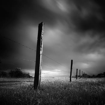
The 2009-2010 Reflections theme is “Beauty Is...” which can be interpreted in your own unique way. Decide what the phrase means to you and how you can explain, depict or portray in a photographic form what the concept of beauty is. Interpretation of the theme, artistic merit and creativity are the criteria by which each entry is judged. If you are chosen as a finalist for Shorecrest, your artistic work will go on to the Shoreline Council level, then possibly to State and National levels. This is a great way to be recognized for your artistic talents and ability to express a theme in a creative way.
What do you think “Beauty Is...”? Think out of the box, get creative, remember the compositional techniques we have studied and remember for every image you take, try to make it unique, creative, and something you are proud of...
Click here for more information.
Click here for entry form.
Contrast filters are necessary for increasing or decreasing the amount of contrast in your print. If your test prints are coming out much too gray, then increasing the number of your filter will increase the contrast, making the whites whiter and the blacks blacker. Everyone has a different preference when it comes to deciding which contrast filter to start with, but I have always found for my purposes that a contrast filter of 3 suits me well when I’m working on a black and white enlarger.
Changing your contrast filter as you do test prints will also affect your exposure times, so don’t expect the same results in exposure when changing from a 3 to a 3 1/2 or a 4. You will need to make a new test strip!!!

The first photograph here shows the effect of a lower contrast filter. The second illustrates the effect of using a contrast filter higher in number.

